Houston, Harris County, Texas: Comets Unveil New Logos on Oct. 29 as Four-Time Champions Return to the WNBA in 2027
The Houston Comets unveiled the team's new logos on October 29, opening the modern chapter of one of the WNBA's founding franchises. The Comets played in the league from 1997 to 2008 and won four championships; they will return for the 2027 season, following the May announcement that the Connecticut Sun had been sold and would relocate to Houston. Since that announcement, team officials have been designing the brand identity for the relaunch.
League rules prohibit reviving an old design directly as a primary logo, so the team could not simply copy its former mark. Houston senior creative director Jose Lopez and senior director of marketing operations Taylor French said the new design had to keep the team's history while looking forward. The Comets kept their original navy blue, red and silver palette and drew inspiration from the old secondary "H" icon for a sleeker, modernized treatment. The new primary and global logos feature a red basketball comet streaking across a blue letter "H" for Houston, slanting upward to symbolize the team's ascent and pursuit of greatness; four diamond-shaped quasars represent the four championship trophies, three in silver and one in white for the Lone Star State of Texas.
In all three logos, the words "Houston Comets" use lowercase letter "t"s, echoing the retro rebrand the Houston Rockets underwent this summer.
Source: GSM · USA (original Chinese edition)
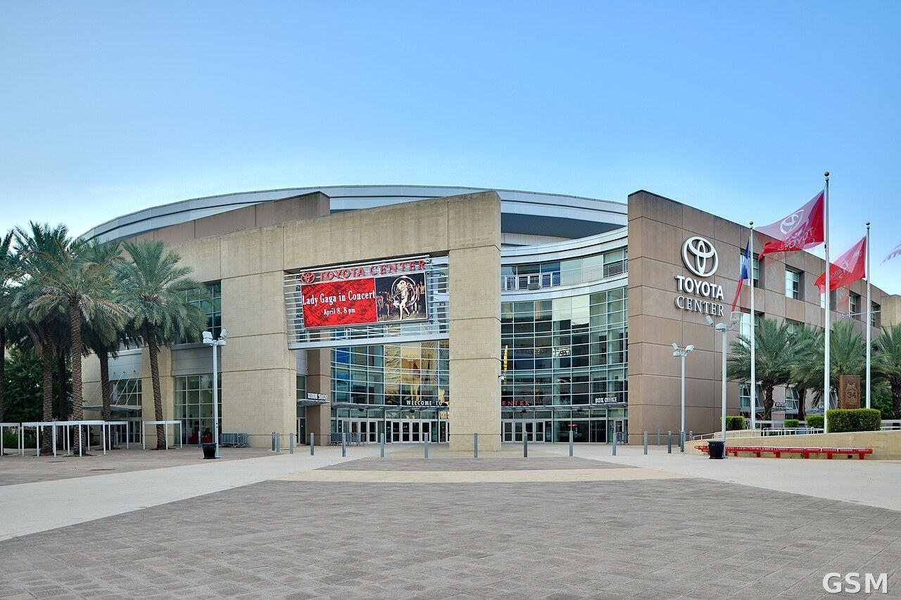
Photo: 图:休斯顿丰田中心外景,彗星队2027赛季主场。Ed Uthman 摄,CC BY 2.0,经 Wikimedia Commons。 / Toyota Center exterior in Houston, the Comets’ home arena for 2027. Photo: Ed Uthman, CC BY 2.0, via Wikimedia Commons.